When your job is to make something for someone else (like a client), you go through a series of clearly-defined phases. Let’s take digital projects as an example. It could be a website, an app, or a web app:
- Discovery: What is this project all about? What are the goals?
- Design: What is it going to look like? How are users going to interact with it?
- Development: Give all of this to a developer and have him/her build it.
- Testing and Release: Work out all the bugs and then release it into the world.
Sounds pretty straightforward, right? It is, but this all-too-common list of steps leaves out a key part of the process: reviews.
Internal reviews, client reviews, and other stakeholder reviews.
Digital Difficulties and The Print Mentality
A lot of people still have a print mentality: they see a design and it’s pretty easy to imagine what it will look like when it’s finished. As in, it’ll probably look exactly like the design they’re looking at.
In the print world, that’s generally true.
But in digital, showing someone a design of an app leaves out most of the experience. The design tells you what the app might look like, but often times crucial questions are never even asked:
- What happens when you click (or tap) on a button?
- Are there any hover states?
- How does this look on mobile?
- Does anything happen when you long press on a button?
- What is the user’s mentality when he’s on this screen?
What winds up happening: An Example
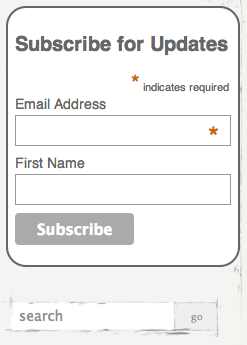
Check out the form below. It’s a familiar thing—an email subscription form with a search button beneath it.

Form taken from The Writer’s Coin
It’s a simple little subscription form with an innocuous search field below. What’s the big deal?
Here’s the big deal:
- Is the email form going to attempt to validate that an actual email address has been entered into the form when a user hits subscribe or when a user moves away from that entry field?
- Do you want to track an event when a user clicks into a field so you can see where he’s “dropping off” in the process?
- If a user hits Subscribe without entering an email address, what do you do? What do you show the user? What is the message, if any?
- If a user does enter all the information and then hits the button, what do you show him/her? Another page? A message right there on the site? Are we tracking this event in our site analytics anywhere? Do we want to?
- On the search form, how do we want to organize our search results? What is the logic? (FYI: this is a huge nightmare and I recommend just piggybacking on Google for any of your search needs, they know what they’re doing)
I could go on and on, but you get my point: there is a LOT going on under the hood of this design.
Here’s what happens when nobody is thinking about this stuff until everything is vetted and approved: chaos. Because when it gets to a developer, he/she doesn’t care what it looks like. They will focus on what’s happening under the hood.
So as we move into the development phase, this causes some problems. If a developer estimated it would take 4 weeks to build something from the time he/she gets the final designs in his hand, and he has to stop what he’s doing to ask a bunch of questions, the timeline is going to get screwed.
A developer that receives the designs with all these questions (or at least most of them) all thought through is going to be much more efficient than a developer that has to stop and ask them and wait for the answers. Plus your developer will get grumpy.
And if these answers have to be vetted by the client? You’re timeline just got smoked.
The Feedback Loop is Broken
Human beings are reactionary. Give them a picture of a digital project and they’re going to react to the picture.
But give them a prototype of a digital project, and you’re going to get the most valuable kind of feedback you can get. It’s going to be feedback on the actual experience of clicking and navigating the project.
That’s the kind of feedback you want to get as early as possible.
The key is making the right thing for people to react to, and that’s where prototypes come in.
Prototypes to the Rescue
Prototypes allow you to make something that’s actually representative of what the digital project is going to be.
Prototypes become especially important since most web projects are now responsive and many clients are still relatively new to what that means and how that works.
So instead of building a picture of a website to get reviews, I recommend building a prototype as early as you can and getting feedback that way.
The (overly ambitious) goal is to give a developer everything he/she needs to build your project without having to ask a single question.
Prototyping Tools

Prototype on Paper (POP)
This is one of my favorite tools simply because it’s so much fun to play with. You start by drawing a simple sketch of an app on paper (paper is always a great way to start, FYI). Download the app and take pictures of each screen you’ve drawn. Use the simple interface to wire up the buttons to other screens and voilà: you’ve got a working app prototype.
Projects: Apps
Users: Anyone, it’s that easy to use

Moqups
Moqups is my preferred tool for creating wireframes (though I do like Balsamiq too). It’s easy, it’s feature rich, and it allows you to spit out interactive PDFs that can serve as prototypes for virtually any kind of project.
Projects: Websites, apps, anything
Users: Anyone, easy to use
HTML and CSS
The goal here is to go straight into code. You get to experience the prototype in the actual browser, which is where the website is going to live in the end. In a perfect world, you can re-use the code and use that as the starting point for the actual project.
Projects: Websites, web apps
Users: Developers, those with HTML+CSS knowledge
Proto.io
I only used Proto.io for one project, but it worked great for what it was: a tool to build app prototypes for which we already had designs. I was able to upload our designs and add some basic interactivity/animation.
Projects: Mobile apps
Users: Designer, PMs
Macaw
I’ve talked about tools like Macaw before and what they bring to the table. But they basically allow you to create a design in a Photoshop-like interface, while HTML and CSS is being generated in the background. So ideally you can have your designer build something real quick and then have a working prototype of that design available immediately for feedback.
Earlier Feedback
Building a prototype of a digital project early on allows you to be proactive in the process of acquiring feedback from stakeholders and clients.
You probably won’t be able to answer all of the questions that will come up, but you’ll put yourself and your project in a much better position to succeed by building something that’s closer to the actual experience and getting feedback that way.
If you’ve had any experiences (good or bad) with prototypes, please share them in the comments!
Read More About Prototypes
Building Prototypes in HTML and CSS – Creative Bloq
Design Better and Faster with Rapid Prototyping – Smashing Magazine

